What I Did On My Summer Vacation (part 2)
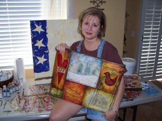
 This is me atop Moro Rock. It's a large granite dome about 6,725 feet up. The climb to the top is up 400 steep stairs, carved into the granite. If you're in moderate shape, it's not a challenge physically... but boy is it mentally! Looking at the steps was not the problem. Looking out and down was a different story (for me anyway).
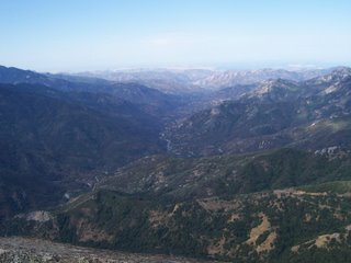
As you can see from the second photo, the effort was well worth it. The view spans the Great Western Divide. We were told that if it had been a completely clear day, we'd be able to see all the way to the ocean. Pretty amazing, this planet of ours....
 Yesterday was a challenge for me as well, but not in a "fear of heights" sortof way. It was more of a "too many deadlines, not enough time" sort of stress. Plus it's always hard to come back from a wonderfully relaxing trip to everything that's been piling up while you've been away.
I spent most of the day tracking down my Beverly Hills art show application, which is due today. You may remember that I mailed it on July 20 via certified mail. Plenty of time. The post office is still showing it hasn't been delivered. After a lot of phone calls and pleading, the Beverly Hills people confirmed that they have it, but I ended up looking stupid. What is up with the post office these days?!?!
I'm also trying to wade my way through the tons of proposals I have from different banks. I need to get setup to accept credit cards for shows, and it's a difficult decision to make. Each offers something slightly different than the others and it's hard to determine how it all will pan out in the end.
One other thing I learned is that I DO NOT like doing art for themes that I'm not that into. I got this hair-brained idea to submit a couple of pieces for this show in Nevada. The theme is "Lucky 13". Now, you'd think being the Vegas girl that I am, this would be right up my alley. I adore Vegas, but not so much in my art. At any rate, I'm almost finished with the pieces I want to submit, but I really hate them. I mean R E A L L Y. But, what can I do? Lesson learned. No more conforming to someone else's ideal. If a theme and my passion coincide, great. If not, walk away. Simple as that.


1 Comments:
The post office SUCKS. Period.
And yeah, themed stuff is hard unless you really truly resonate with it. But I am guessing the works are not as bad as you think, like you are being waaaaayyy too hard on yourself? Like I've never done that, lol.
Post a Comment
<< Home